Name (s) for first CD
Magic mix
Nervous chaos
Understatement
Mistress
Name (s) for the artists
Honey
Fran Slam
Dilly Emilia
Tiny Emilia
E love
Tricky
Sista em e
Ms. Sweeet
Sass Katt
Tina vixxen
Image
Both will have big hooped earrings
Loads of lipstick
Provocative and baggy clothing
Loads of make up
Snap back
Age (s)
19 they are twins
Motivation for CD
Twins
Both had a bad past
Wrote about it together
Friday, 29 November 2013
Friday, 22 November 2013
Drafting and planning- Draft layout
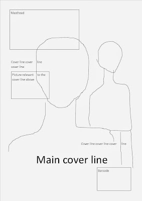
I have done a draft of my layout. My main image will go over the masthead. I thing this adds a sense of importance to the main image, and i would like a lot of focus to be on the main image. The coverlines and smaller images will go over the main image however they will not ominate the front cover.
This is what my template looks like. However i can see that the cover line and picture about iggy azalea cover nicki minajs award, and this is a main part of the picture, therefor if my template needs to be changed so that the picture looks better then i will do so. However i will take my picture baring in mind where i want my cover lines.
Tuesday, 12 November 2013
Friday, 8 November 2013
Research into similar products and organisation- How i want my artists to look
Here are pictures of Iggy Azalea at concerts, in music videos and out on cat walk events. Seeing this helps me to decide the style of the people in my main image as Iggy is a rapper and i can get tips off her pictures on what to wear.
Drafting and planning- Visual thesaurus of rap
I have looked up rap in a visual thesaurus and it showed me some names related to rap. I did this to help me with the name of my magazine. Even though there were many that were not relevant the words such as whang and knock made me think that i want my magazine to have a bold word as the title.
Thursday, 7 November 2013
Tuesday, 5 November 2013
Research into similar products- Looking at other generes for ideas

Here is a contents page, i like how all the writing is on the side with a slight description underneath. This contents page is also very neatly set out and the writing is black on a white background. There are also visual aids and i think visual aids are very important as at first glance it makes the magazine more appealing.
I would not like my contents page to look like this. There is to much writing in my opinion for this to be a contents page. A contents page should be for people to look at and know what is in the rest of the magazine.
Monday, 4 November 2013
Research into similar products- Other styles of magazines for ideas
This double page spread has a lot of images on it, and for my double page spread i would also like many pictures. I think that visual aids are very important and draw the reader in further. There is also red and white writing that stands out on the black background and makes it easy to read. I would like my writing to be very viable so that nobody is not able to read the writing or has difficulty in reading it. The font of the title is also very good and ties in with the rock theme of the band.
Drafting and planning- planning preliminary task

This is the picture that i will use for my magazine draft. It is not too busy which is what i wanted and there are very light colors around the image so that the font writing can be black.The style of music i will do is RnB for my draft. This image is also very good as everything is clear and all of her face is visible. However in a main image it is a lot more effective if the person is looking at the reader. This picture would be a lot better if the person was looking at the camera. This is a error that i have now learnt from.
Subscribe to:
Comments (Atom)


