Wednesday, 30 October 2013
Research into similar products- Similar artists
Here the man is standing against a background of silver. I would like the person/ people in my main image to have a simple background of white or black so that the magazine does not look to cluttered. I also may want the people in my main image to be standing against a brick wall. Also the clothing style is important, this man is not dressed like a typical rapper however i would like my models to be dressed stereo typically.
I need to decide weather to have one two or more rappers on the front of my magazine. In my opinion one rapper looks better, i think that a group of rappers would make my magazine look to cluttered and this is nit how i want it to be presented.
Friday, 18 October 2013
Organisation- How i am doing with my blog so far
My blog is well organised and all of the posts have a clear title. I have used a lot of picture examples and these visual aids are very important and helps me a lot with planning my magazine. I have justified my codes and conventions task but i could of used a lot more detail and gone into more depth on why i choose to do what i did. I could use this when thinking of my magazine when seeing what looks right and what doesn't. The magazines do look realistic, however some of the writing and pictures could be moved around to look straight.
Thursday, 10 October 2013
Research into similar products- Music Genre
'Some rap music can make people feel secure about the environment that you live in. A lot of rap artists come from environments that aren't very wealthy. They express their feelings and speak their minds through their music, which makes the listeners feel connected t the artist. As for how the listeners feel, their self- esteem may boost knowing that there are other people who came from another neighborhood similar to theirs, and had the ability to get rich.'
Rappers rap about there life and what they have become, they rap about the hardships that they have had.
It can make people listen to their story and understand more about the world.
It can also give people hope who have nothing and feel as though they are in the same place that the artist was in, and it may help them get through the struggle.
Research into similar products- Other styles of magazines for ideas
Above and below are the types of magazine covers that i will be looking to create. I like the bold colors of yellow and black. Also the main images are all of a rapper that is doing a serious pose. I also like the two above and bottom right because the main image is covering the mast head, i think this is good because it makes the main image a main focus. Also all the main artists are looking at the reader, this is called direct address and creates a consumer relationship.
Drafting and planning- preliminary task
I choose a picture of a sixth former outside of st Thomas Aquinas main entrance. I choose to give it a red tint as the schools main colors are red black and white. For the main heading i choose to put it in miulti colors, this is because on the feed back from pupils of sixth form they said that bright vibrant colors and house colors are the colors that they would like to see. There is no bare code because the magazine will be free. I have put 'School football..' in a shape to make it stand out because something that was very clear on the questionnaire was that people wanted to see results.
After analyzing my magazine i can see that the edit on the main image look effective. I will not edit my main image again so that it does not look realistic and like a stereotypical magazine.
Drafting and planning- Pitch- Codes and conventions
I used writing that is sinister and mixed up a bit like the main image. I also included a free magazine to be put inside to entice the audience. Puggs and Puffs can be very important in terying to make a person buy your magazine. I will use a Puffs and Puggs to try and make my magazine seem more appealing.
Drafting and planning- Putting codes and conventions onto a magazine
I used bold writing to fit in with the main heading i also used guitars with fire coming off them to give a larger feel of 'rock' Rock is often associated with fire and this is why i have added this in. I am aware that one of the guitars is higher and this is a human error. I need to make sure that on my final piece this does not happen.
Drafting and planning- Creating Conventions relevent to the magazine
This picture and the main heading seem very simple and i wanted to keep to that theme. 'Bjork tells ALL' lets the person reading the front cover know that the singer will be reveling a lot of information about herself'
Drafting and planning- Using conventions on a template
I thought that jazz would be the best type of music for this band as they are all dressed as though a jazz band would dress. They also have a saxophone which a lot of jazz band use. I chose to call the band blow because the word is to simply play a instrument. The words are also in red and this is easily readable.
Drafting and planning- Practice creating a magazine with a few codes and conventions
Having Drakes opinion means that different genres of music would be involved. It is aiming at teenagers and anyone who likes RnB music. I have put Drake over the main image as this is more practice to what i want to do. I have also added in a bar code, a cover line and a main cover line. I have also linked the cover lines with the magazine and this is very important.
Thursday, 3 October 2013
Drafting and planning- Looking at typography
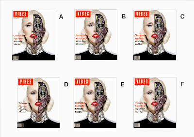
I think that image E has the best font for the magazine. I think this because it is the same font as the mast head and therefor helps bring the whole magazine together. Each letter is also broken up but it is not broken up to much. It is also a bold text that fits in with the bold image. It also fits in with the words of the cover line 'machine motha'
Also B and F are good options, they are both cover lines that fit with the mast head as they are similar fonts. E B and F all add the the chic look of the magazine.
My least favorite one is C, this is because it is a childish text and this is not the theme that is trying to be portrayed. D is also not a good theme, it makes the magazine seem broken up and that it does not fit in with the main theme.
Subscribe to:
Posts (Atom)