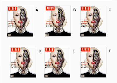
I think that image E has the best font for the magazine. I think this because it is the same font as the mast head and therefor helps bring the whole magazine together. Each letter is also broken up but it is not broken up to much. It is also a bold text that fits in with the bold image. It also fits in with the words of the cover line 'machine motha'
Also B and F are good options, they are both cover lines that fit with the mast head as they are similar fonts. E B and F all add the the chic look of the magazine.
My least favorite one is C, this is because it is a childish text and this is not the theme that is trying to be portrayed. D is also not a good theme, it makes the magazine seem broken up and that it does not fit in with the main theme.

No comments:
Post a Comment